
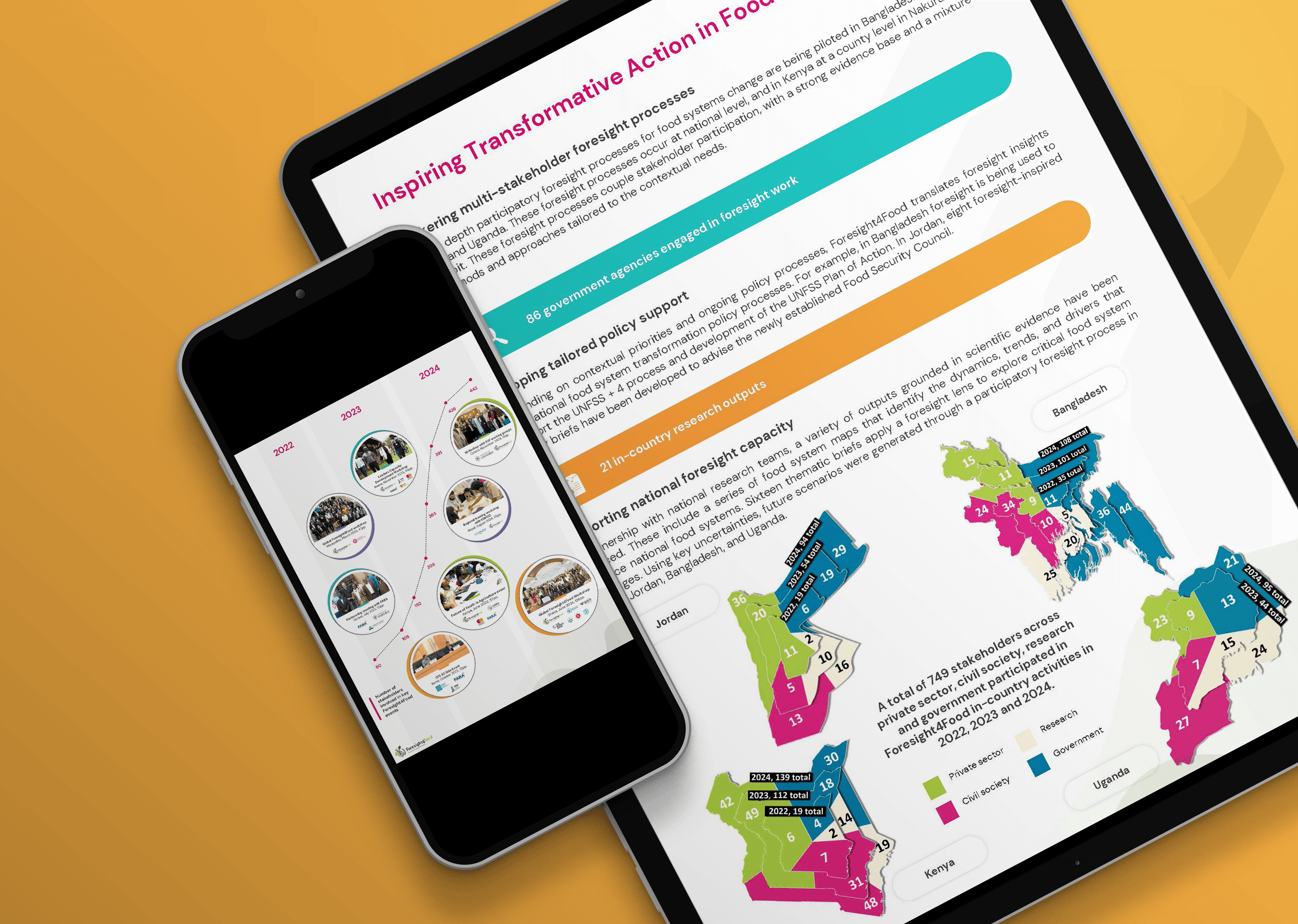
An infographic is a visual way to structure and communicate complex information. By transforming data, statistics, and detailed content into a clear visual story using charts, diagrams, icons, and illustrations, you can make your message easier to understand and more engaging for your audience.
Whether you're a researcher sharing your findings, a government organization reporting on progress, a nonprofit communicating impact, or a startup explaining a product or process, an infographic helps you turn complex information into something people can quickly understand, remember, and share.
You can use them for:
Reports that make research findings, impact, or complex processes easier to understand.
Presentations that help you explain your message at a glance and answer questions more effectively.
Social media to turn key insights into engaging, shareable content.
Websites and blogs to make long-form content more accessible and increase reader engagement.
Awareness campaigns that communicate your expertise in a visually compelling way.
Explainer visuals or one-pagers that summarize projects, policies, strategies, or research.
Data visualizations that present statistics, indicators, or monitoring results in a clear and memorable way.
Infographics designed to be shared, reused, and built to last.
In my designs I make sure that the infographic you receive:
Are easy to share.
Simplify complex information without losing the key insights.
Reach a wider audience, including people in and outside your field.
Increase engagement with your reports, presentations, and online content.
Give readers a clear entry point into a longer report or research publication.
Are able to be reused across multiple channels, including presentations, websites, newsletters, and social media.
Build a consistent visual template that can be updated each quarter, year, or project cycle, saving time on future communications. (Optional)
FAQ