What can braille teach us about visual communication? More than you might think. Here are three lessons from inclusive and accessible design that have changed the way I create visuals, and why they matter for anyone working in sustainable development.
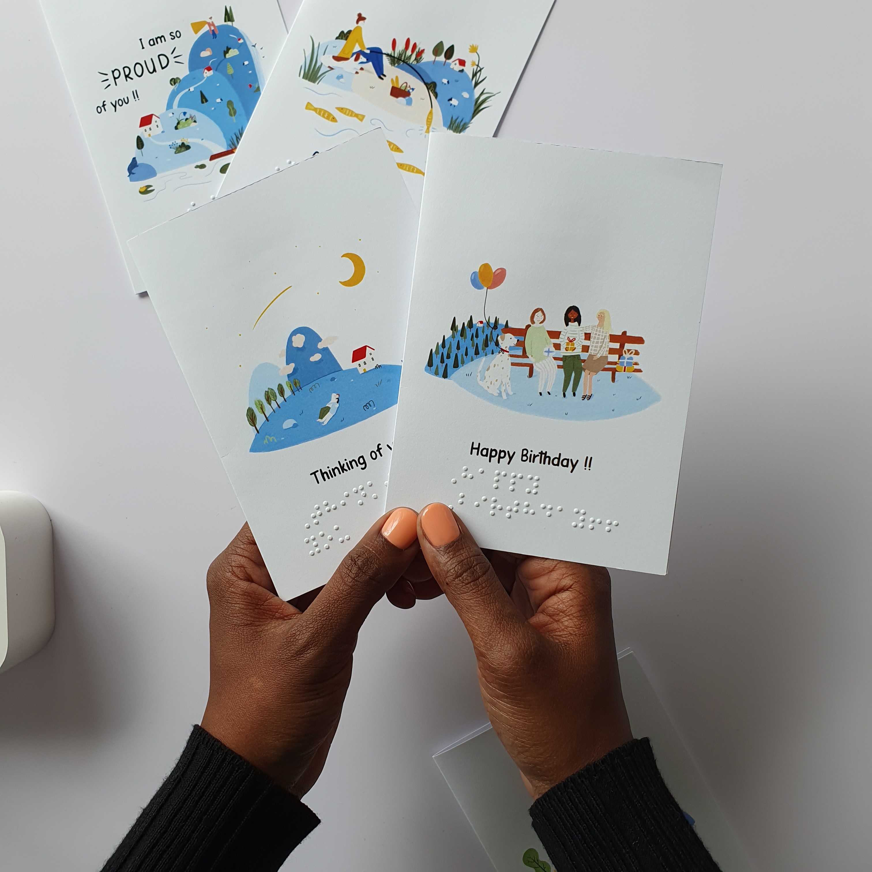
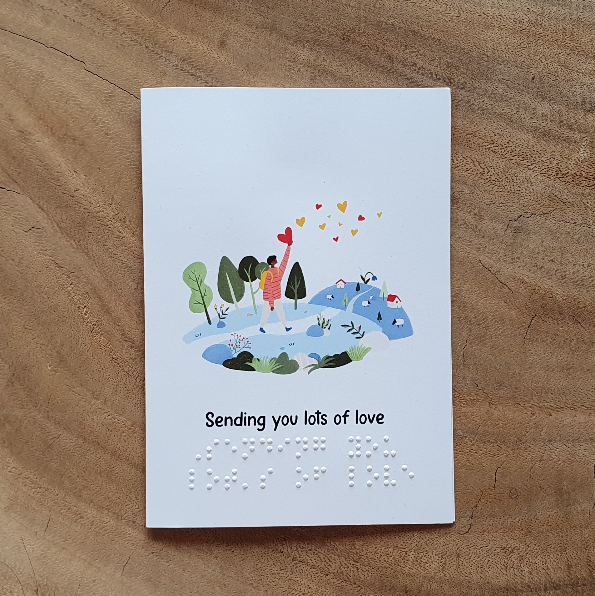
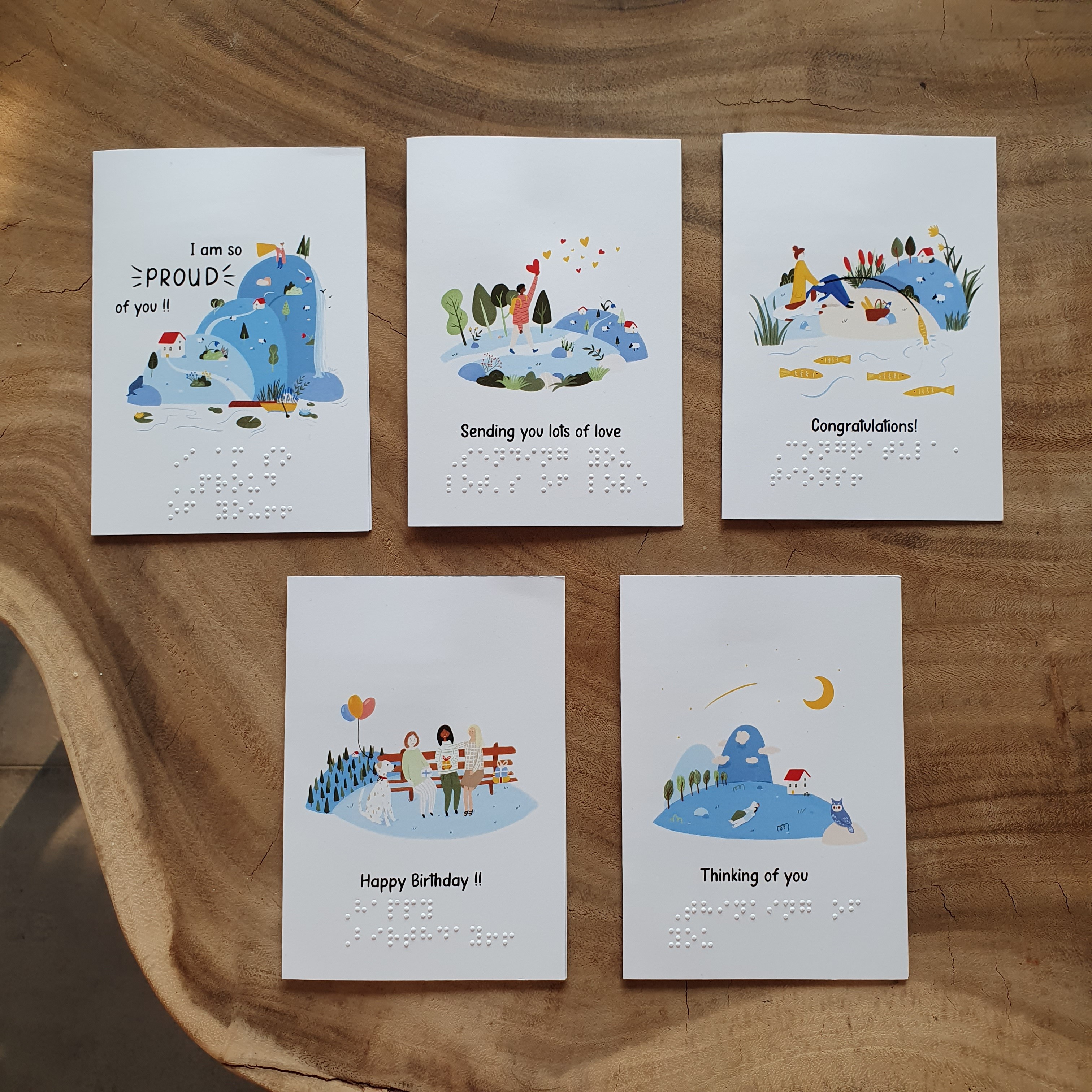
In 2021, I designed a collection of greeting cards with Braille on them. This was during my paper goods era (I think every artist goes through one at some point). People loved them. They bought them, shared them, and they even ended up being featured in magazines internationally. Well... across Europe at least. I'll take it!
My business has always had its roots in diversity and inclusion. With this project, I wanted to see how far I could take those values in my work. I’m also not a fan of mass production, consumerism, or all the environmental pressures that comes with it. So my goal was simple. Could I create one product that more people could use and enjoy?
Before I get into the lessons this project taught me, let's take a step back. What do I mean by inclusive and accessible design?
To me, it's about designing products, services, and spaces that are accessible, usable, and welcoming to people of different backgrounds, cultures, and abilities. Ideally, involving those people in the process too. Adding braille to a greeting card felt like such a small detail. But it had a much bigger impact than I expected.
Here are three lessons that I apply to all my work now.
1. Inclusive design makes communication stronger, not more complicated
When I launched the braille greeting cards, people weren't just excited about the illustrations. They were excited because the cards included more people. I received a message from someone in Germany who bought the cards, “For the first time in 80 years, I could give my father who is blind a happy birthday card”. That changed something for me.
Instead of asking myself, "How can I make this look beautiful?", I started asking, "How can I make sure as many people as possible can use and enjoy this?" That one question changed my whole approach to design.
I think design that reaches more people also lasts longer. It doesn't exclude audiences, so it doesn't need to be redesigned later for another user group. In that sense it’s sustainable too, as it doesn't use up extra resources, which is an important value in my business. To me, sustainable communication is communication that keeps working over time and across different users. So this felt like a win-win.
2. Design is about experiences, not just visuals
I love illustrations. I love a good aesthetic. I love colour palettes. The eye deserves something beautiful to look at, right?
But this project reminded me that design isn't only about what we see. It's also about what we experience. As illustrators and designers, we often focus almost entirely on sight. But people don't experience the world through just one sense.
When you approach inclusive and accessible design as a way to create meaningful experiences, it opens up opportunities you might not have had otherwise. It can even help you convince a director or client to say yes to an idea you're really excited about, purely because of inclusive and accessible design.
For me, it opened up a whole new way of thinking about visual communication.
3. Inclusion inspires innovation
One of the design goals from the very beginning was that the cards had to be as accessible as possible.
The funny thing is... I had no idea what they were going to look like. It wasn't until I started researching, sketching, and playing with ideas at my drawing table that braille became the answer.
That taught me something I have embedded into my workflow today. Accessibility isn't something you add at the end of a project. It can actually be the starting point for new ideas.
Designing with braille pushed me beyond the way I normally think about visual communication. Instead of reducing my creative options, it expanded them. It made me think differently about materials, interaction, and how people experience a the end product.
Inclusive and accessible visualiations
Looking back, I realise this project shaped much more than a collection of greeting cards.
It changed the way I approach every project.
Today, when I design visual communication or infographics, I still start with the same question: who needs to interact with this information?
Whether I'm helping researchers explain their findings, illustrating icons for a website, developing a project branding, or visualising impact reports to make information easier to understand, I think about how different people will experience that information. This will determine the font, colors, placement of information and much more.
I believe that's where good visual communication starts.
If you're curious about my approach, or you'd like to explore how inclusive visual communication could support your project or organisation, I'd love to work with you.
And if you'd like a set of greeting cards, I'm selling a set (5 cards) for 12,99 EUR. Send an email to contact@raanii.eu with your address, subject: "Braille Greeting Cards Order" and I'll get back to you with the details.